
ℹ️ This article is an introduction to the workflow & explanation of all the main steps involved in developing efficient & practical design systems for result-driven teams.
⏱TL;DR:
- Design systems shouldn't be considered a simple task nor should it be a theoretical concept for designers only.
- Design systems should empower developers & offer a common language with the designers for optimal collaboration.
- By adopting the utility-first CSS methodology & Tailwind's configuration file, designers get a clear structure for their design systems while developers can swiftly work with the generated classes without adding new CSS
- This workflow provides for clarity & structure when both teams are working on their respective files, and allows for cleaner code, higher velocity, and easier to maintain.
The Design System Workflow
❝ Design is not just what it looks like and feels like. Design is how it works. ❞
— Steve Jobs
Getting started
Creating a design system from scratch should be considered a long term plan, not a one-time assignment on your to-do list. In this collaborative documentation, organizations must outline all the information required to speed up the design handoff and serve as a source of truth for all future designs.
This collaborative work can be challenging and can lead to an increase in frustration among your team members if not done correctly. In this article, we'll have a quick look at one of the many tactics that companies can add to their workflow in order to build the best design systems.
Finding a common language
In software development, it appears that a lot of teams base their production on an "abstract" design system or style sheet provided by the designers, made of some pdf or worst, giant png files. More qualified teams tend to use online tools like inVision, Marvel or Zeplin, giving only a visual depiction of the expected result. Nevertheless, this comes with no development guidelines, offering only basic generated CSS that can sometimes be unreliable.
This absence of detail and structure produces a discrepancy in various parts in the design files as well as the codebase (like shadows, sizes, spacing, button sizes, corners are often the worst examples of this..).
Without intent, structure never grows, only chaos emerges.
This circumstance leads to a messy codebase, each developer following his personal workflows, ideas, and conventions. Add it to the high employee turnover that this industry is having and we can find ourselves in situations where no one understands what the former developer did on certain components. It becomes even more cumbersome in long projects with bigger teams, where collaboration becomes the most important element for success.
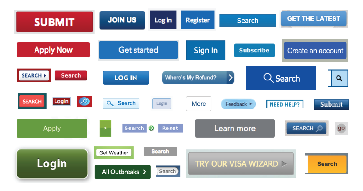
A good example of this situation was visible on the US Government's websites before they changed their strategy and started implementing a design system. When they analyzed all of their websites, they found out that they had too many variations of the same components, creating a big confusion for designers and developers on how to structure their work.
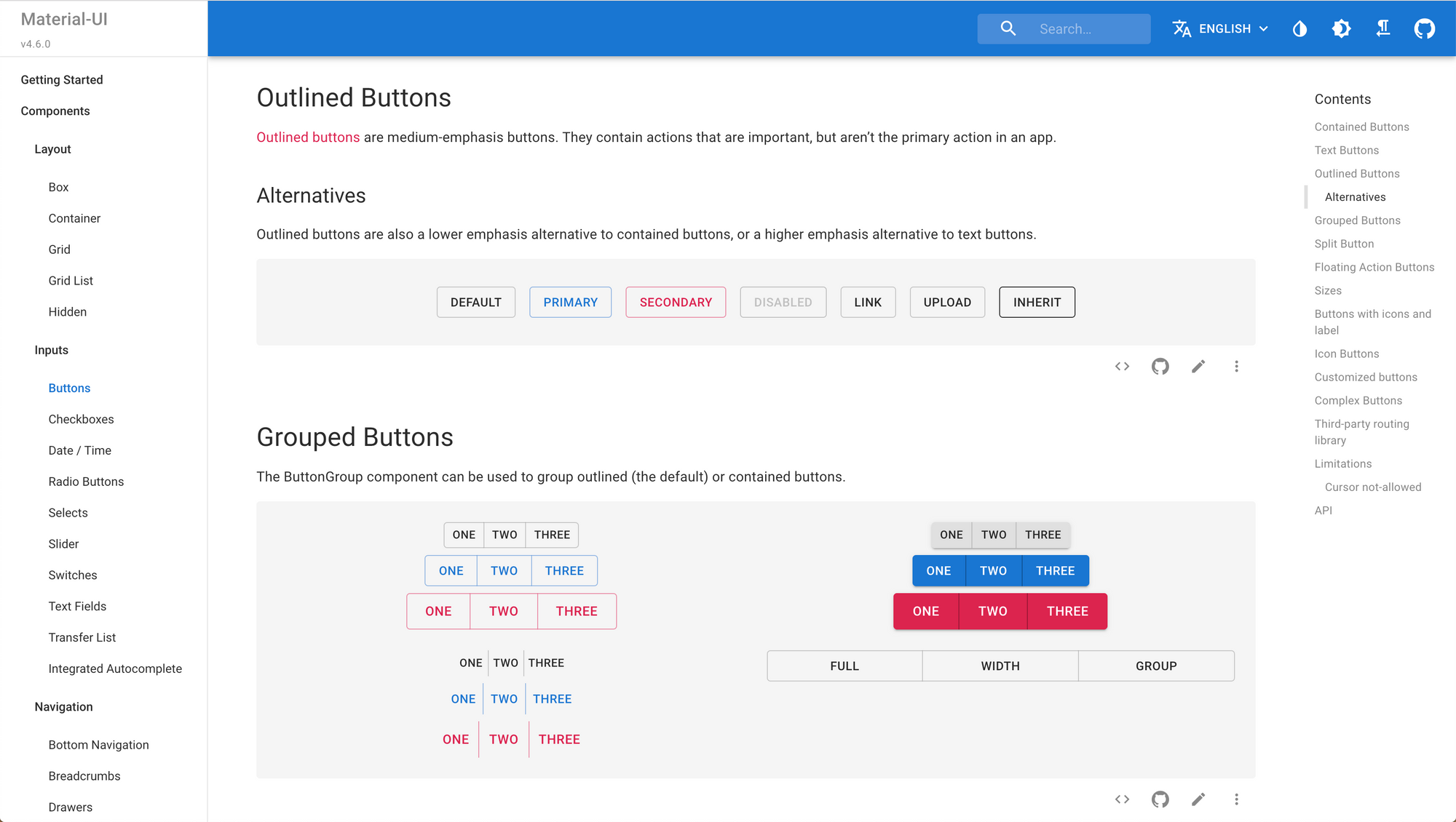
Users also get confused when they don't find a logical pattern on your components like here:
To fix these issues, the team must first decide on a common vocabulary & workflow. One popular solution is to use frameworks based on Bootstrap, Bulma or Google's Material Design (like React's Material UI library) that provides us a good base for building our software. This solution holds many benefits, particularly at the beginning of the project, but it can become questionable in the long term in certain situations.
Building commercial software demands a big investment in the user experience and user interface. Long gone are the days where basic Bootstrap-based apps would be acceptable for users, who expect an experience tailored to their needs.
We also get to a point where designers lose the sense of ownership of their work and the overall user experience gets lost in various design files and CSS. In every stage of development, designers should be able to have a representation of all the screens involved in the user experience to keep a clear picture of the complete workflow and customize the elements following the brand's guidelines.
Building design systems from scratch
When we want to go full custom design we then found ourselves in a difficult position: Should we write every code from scratch risking to fail to keep a good structure OR should we customize an existing framework like material design and spend a lot of times on it to fit the desired experience?
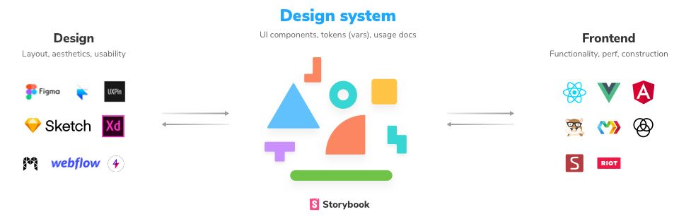
We need to find the middle ground between these two situations to accelerate the workflow, particularly when one of the goals is to build a custom design for our app. This objective can only be accomplished by establishing a common language of the various components of the design system.
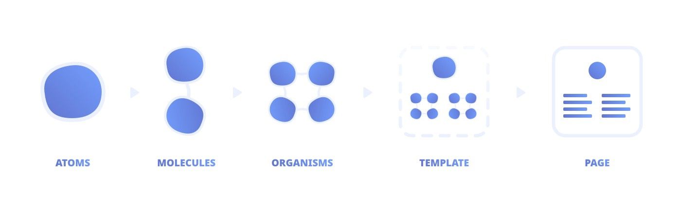
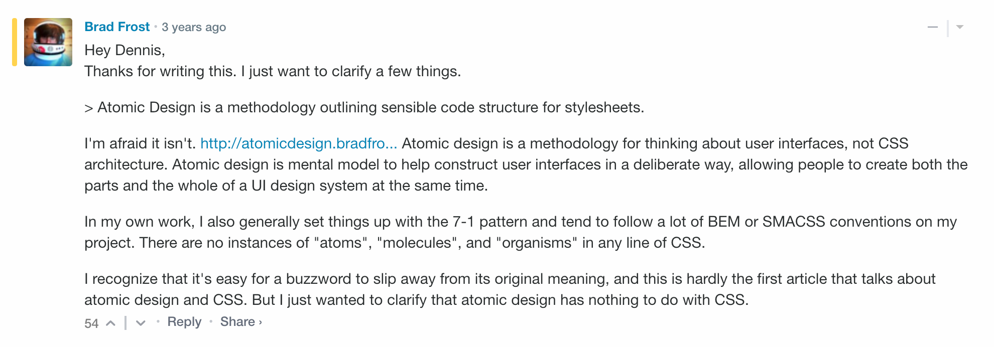
One of the most popular trends in the design community is called Atomic Design and was created to give a structure to our design work. This work by Bran Frost was adopted by a lot of designers and team when searching for a good methodology, hoping for some best practices to follow. In his book, the author describes a methodology composed of five distinct stages working together to create interface design systems more deliberately and hierarchically.
The five stages of Atomic Design are: atoms, molecules, organisms, templates and pages.
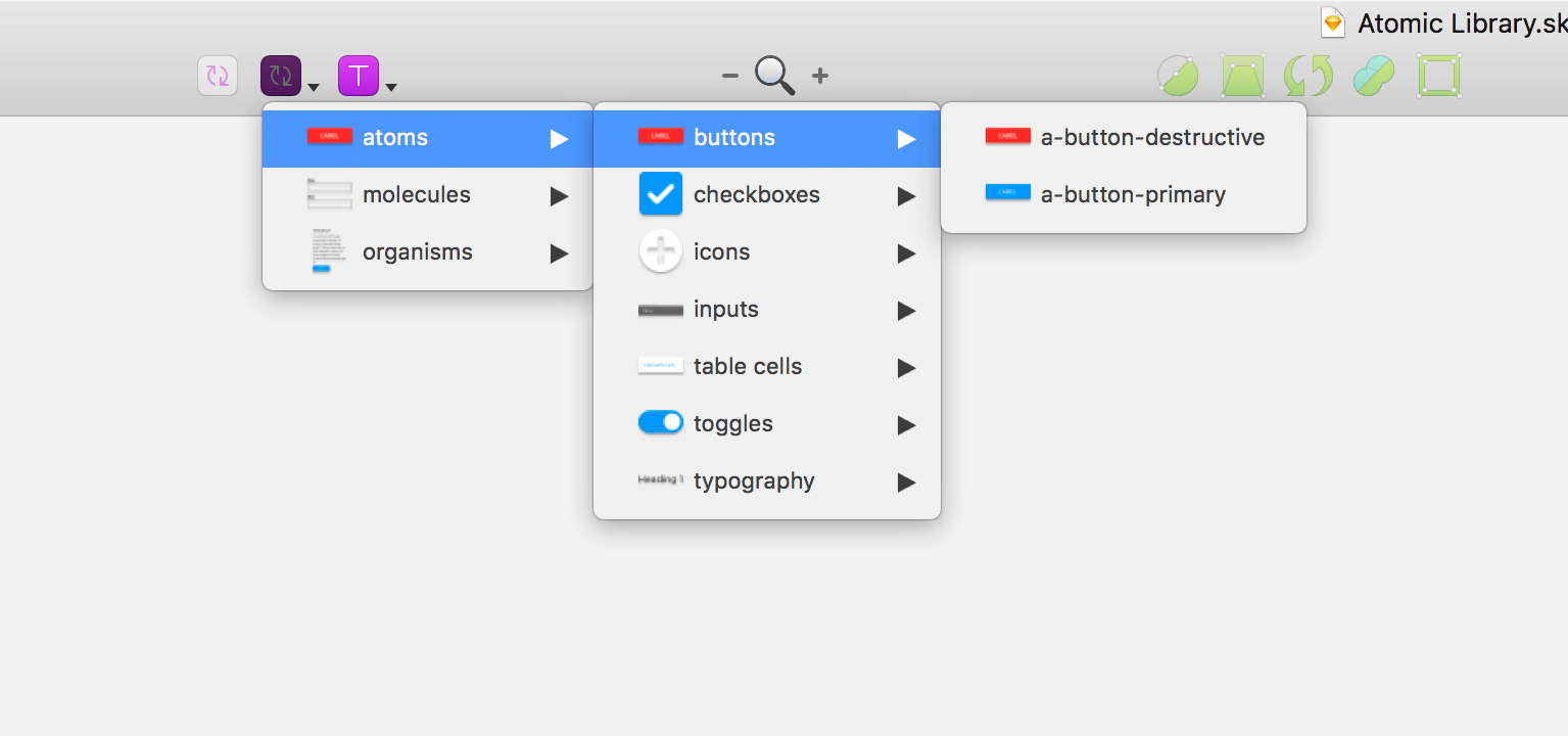
This leads to designers organizing their workflow around this structure and makes creating components very easy. Using the powerful components and symbols features in design tools like Sketch and Figma, this work can even be faster with shortcuts to each element:
⚠️ However, this architectural representation is focused more on the designer's point of view and less about the technical outlook. It does not take into account the structure of the project's CSS file. (Styled components, OOCSS, BEM, Utility first...?) To be more practical, we need to incorporate the development team's ideas and accommodate the design system files to their CSS strategy.
Brad Frost, the author of Atomic Design, has since clarified the fact that its methodologies don’t dictate any CSS structure. Instead, it offers a mental model for thinking about constructing user interfaces.
Now that we understand this, shouldn't another solution exist?
Focusing on the developer experience
Instead of adding another language or an abstract concept (like Atomic Design) why not use an already existing one in our project (like CSS) to get the best developer experience possible? To achieve that result we need to dig a little deeper on the different CSS strategies that offer the best possible developer experience while still making it easy for designers to contribute to this workflow.
@danmall about Design Systems 😬 @clarity_conf pic.twitter.com/JklnU2OL3R
— Nelly Hempel (@Hejnelly_) December 12, 2018
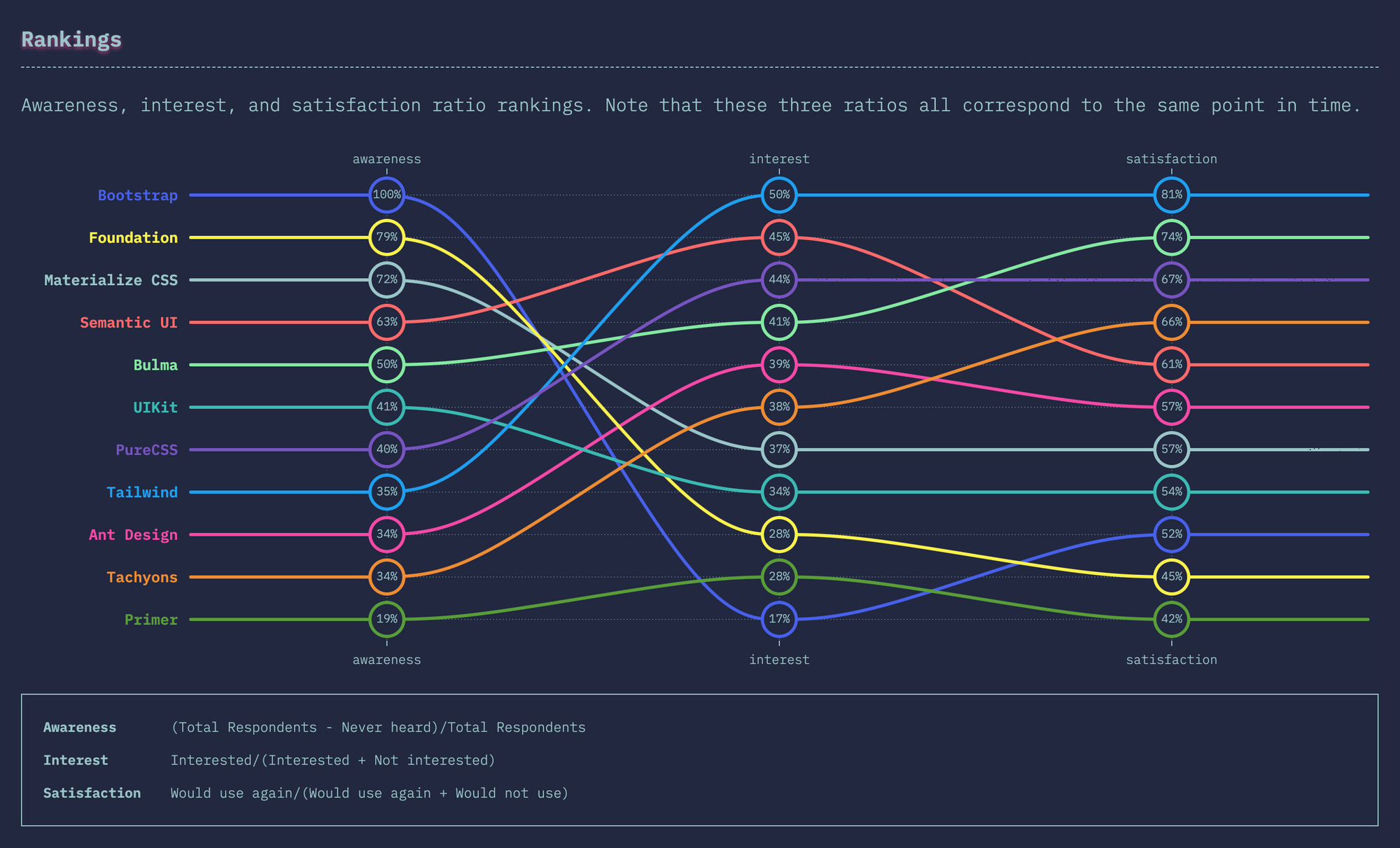
One of the most popular and growing options is called TailwindCSS and relies on utility-first CSS and configuration files to build all the CSS files, components, and structure for our software. It's the framework that shows the most satisfaction and interest coming from the developer community.
The goal of this article is not to present utility-first CSS as a holy grail, but to give a different perspective for designers who are looking to improve their workflow to build the most practical design systems. To achieve that we need to give a proper definition of utility-first CSS and understand its strengths and weaknesses.
Example of a notification component using utility-first CSS (with TailwindCSS):
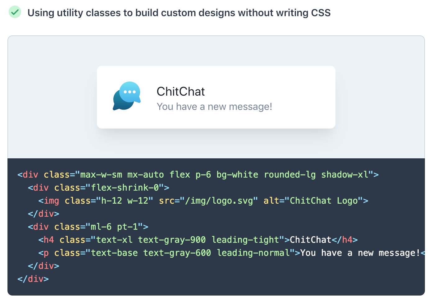
Utility-first CSS, also called Atomic CSS or Functional CSS, is the notion of composing small single-purpose classes with names based on visual function instead of arbitrary class names to apply styles to components. Using this approach, we can identify some interesting advantages for the development team:
- It’s easier to visualize what something looks like just by reading the markup.
- You don’t have to write any CSS of your own, use only existing classes
- You don’t ever have to worry that changing the styles for one thing will break something else (which may make visual regression testing irrelevant)
- No more wasting time inventing bad classnames like
this-wrapper,that-body. - Breakpoint prefixes make responsive a lot easier (no more media queries)
- Customizable to the core. You can add your own utility classes while still making use of breakpoints, pseudo classes etc.
- No framework lock-in that dictates how your buttons etc. should look and feel like. This will make your design unique.
There are of course a lot of other advantages to utility-first CSS, but the focus of this article is only to serve as an introduction to this concept. If you are interested in reading more about it, this page lists articles that cover this topic. To make things much more pragmatic, we'll use the most popular utility-first CSS framework as a base of our workflow.
Working with TailwindCSS
In this article, we will outline one of many approaches in building a design system by adopting the Utility-first CSS & configuration-based workflow that you can find in Tailwind CSS. This open-source framework provides low-level utility classes generated from the configuration file that let you build completely custom designs without ever leaving your HTML.
Tailwind defines itself as "more than a CSS framework, it's an engine for creating design systems."
Tailwind is different from frameworks like Bootstrap, Foundation, or Bulma in that it's not a UI kit. They come with all sorts of already developed components like buttons, cards, and alerts that might help you move quickly at first, but cause more pain than they cure when it comes time to make your site stand out with a custom design. It doesn't have a default theme, and there are no built-in UI components. Instead of customizing existing elements, the CSS classes are generated following the submitted Tailwind configuration file.
module.exports = {
  important: true,
  theme: {
    fontFamily: {
      display: ['Gilroy', 'sans-serif'],
      body: ['Graphik', 'sans-serif'],
    },
    extend: {
      colors: {
        cyan: '#9cdbff',
      },
      margin: {
        '96': '24rem',
        '128': '32rem',
      },
    }
  },
  variants: {
    opacity: ['responsive', 'hover']
  }
}
With Tailwind, you can generate a complete CSS framework based on a configuration file that represents and outlines all the elements of your design system.
Roughly speaking, the value prop of Tailwind is to accomplish, with a bunch of well thought out CSS classes, what otherwise would take you 10 years to do manually (and likely wrongly), with 100 levels of HTML / JSX nested tag soup
— Guillermo ▲ (@rauchg) November 7, 2019
It's really good.https://t.co/jB8goAxZeJ pic.twitter.com/ETNGXj7eth
One the best aspect of Tailwind is the ability to build screens much faster than traditional css approach. Here is a good example made in 2 hours only by Adam Wathan, the creator of Tailwind:
This is where we got with the stream — not bad for 2 hours! 🥳 pic.twitter.com/ovbzeBCbVK
— Adam Wathan (@adamwathan) November 5, 2019
If you want to see the 2 hour livestream, the replay is available on Youtube:
Building a workflow
By making designers a part of the Tailwind configuration step, we create a clear workflow between them and developers:
- The design team builds the app screens with a design system that follows the structure of the Tailwind configuration file.
- The design & development team work together to translate the design files into a TailwindCSS JSON config file.
- The CSS files are generated from this configuration using Tailwind & PostCSS in order to be integrated into the codebase.
- Developers style every components based on the generated CSS using the utility-first approach and publish them on Storybook
- The unused CSS classes are deleted after each build with PurgeCSS and a proper CI/CD workflow.
- Components are shared with the team and imported on projects via Bit.dev
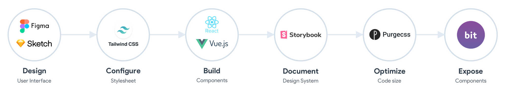
You can of course use Sketch (or other tools) instead of Figma and VueJS, AngularJS instead of React. Use whatever tool fits your teams's preferences and experience.
Finding shortcuts
Utility-first CSS forces the developers on your team to not invent any new CSS Class each time they need to style a component, but they apply pre-existing classes directly in your HTML. Adopting a Utility-first approach will give you a lot of benefits, the purpose of this article is not to dive deep into it but to show what can designers do to make the configuration and CSS generation easier.
You can also find interesting projects, libraries or plugins that use the strength of the Tailwind configuration file like this Figma plugin that generates styles based on the Tailwind configuration:
Another example is this great VSCode plugin that provides great suggestions as you write your component's style code. It also includes features that improve the overall Tailwind experience, including improved syntax highlighting, and CSS previews:
However, one of the few drawbacks of this workflow is that using Tailwind leads to a massive CSS file, caused by the big number of classes generated from the config file. To simply fix this issue, we add in our workflow tools like PurgeCSS that will delete all the unused CSS classes. We then get the best of both worlds: the developers have access to a large list of existing CSS classes that represent what the design team imagined, while still keeping the final output as small as possible fo the production build.
Before, with @getbootstrap :
— Louis Cuvelier 🤖 (@LouisCuvelier_) October 18, 2019
3 CSS files, 372 Ko, 78,5 Ko Gzip
After, with @tailwindcss :
1 CSS file, 61 Ko, 9 Ko Gzip 🤯
Tailwind is so insane. A real life changer as web dev ! Thanks @adamwathan 😍
💡 If you are curious and want to learn more about utility-first CSS, I recommend you read Tailwind's excellent documentation.
If you want to see an example of a complete page built with Tailwind, you can look at various examples on the website tailwindcomponents.com like this clone of the Slack interface:
If you want to look at a real world example on using Tailwind in a big project, Algolia published on their blog the strategy they applied to build a scalable CSS architecture when redesigning their documentation: https://blog-api.algolia.com/redesigning-our-docs-part-4-building-a-scalable-css-architecture/
Structure of a "utility-first" design system
Now that we understand the power of this workflow, what are the parts that designers should outline on their design systems to write the configuration files later on? By analyzing the Tailwind configuration file, we can identify these elements and answer this question. Let's see some examples of these configurations:
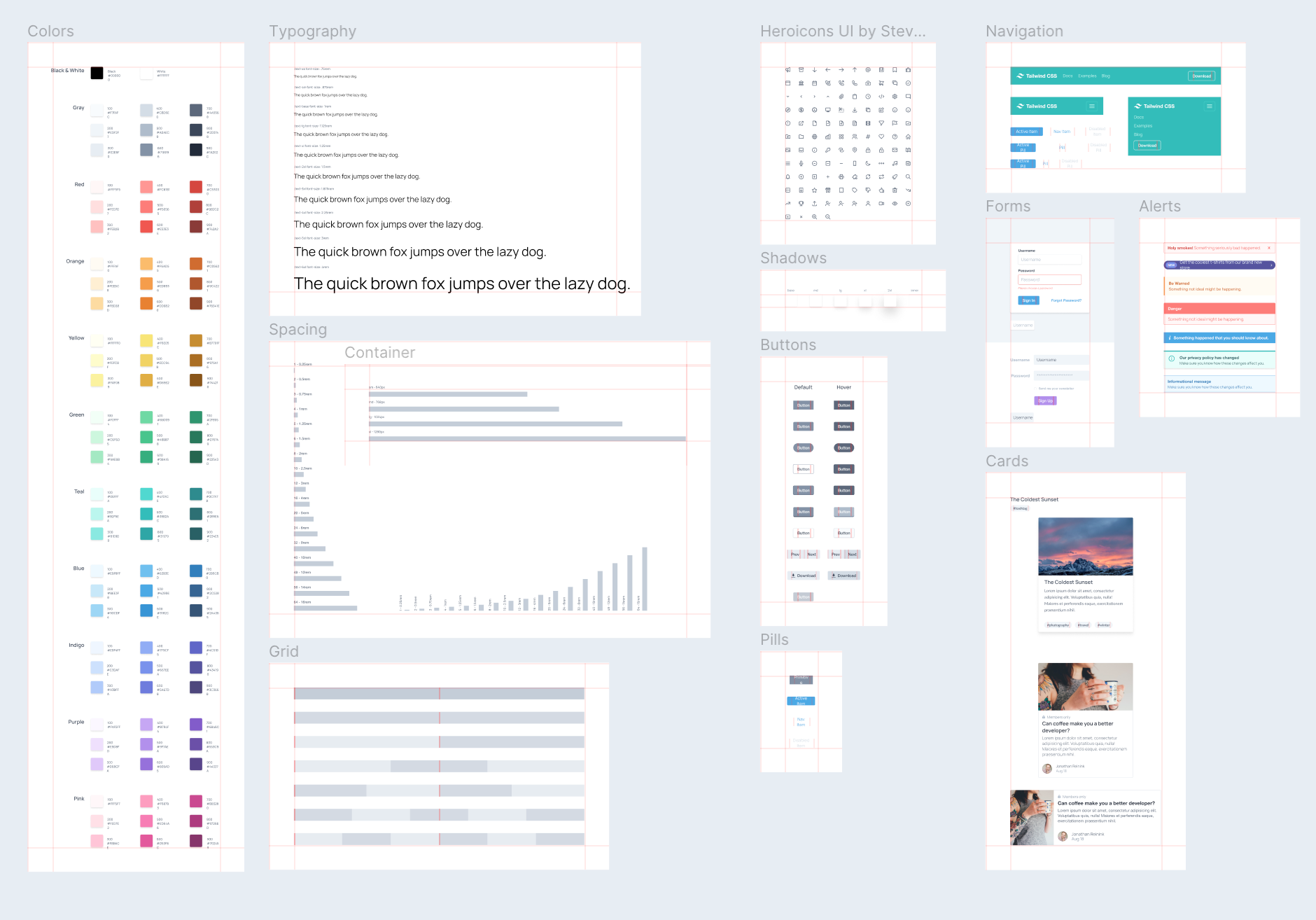
To make your life easier, you can use the Tailwind Figma Kit made by Impulse to serve as a base for your work. All the following examples are based on this kit made by Impulse:
🔗 impulse/tailwindcss-figma-kit
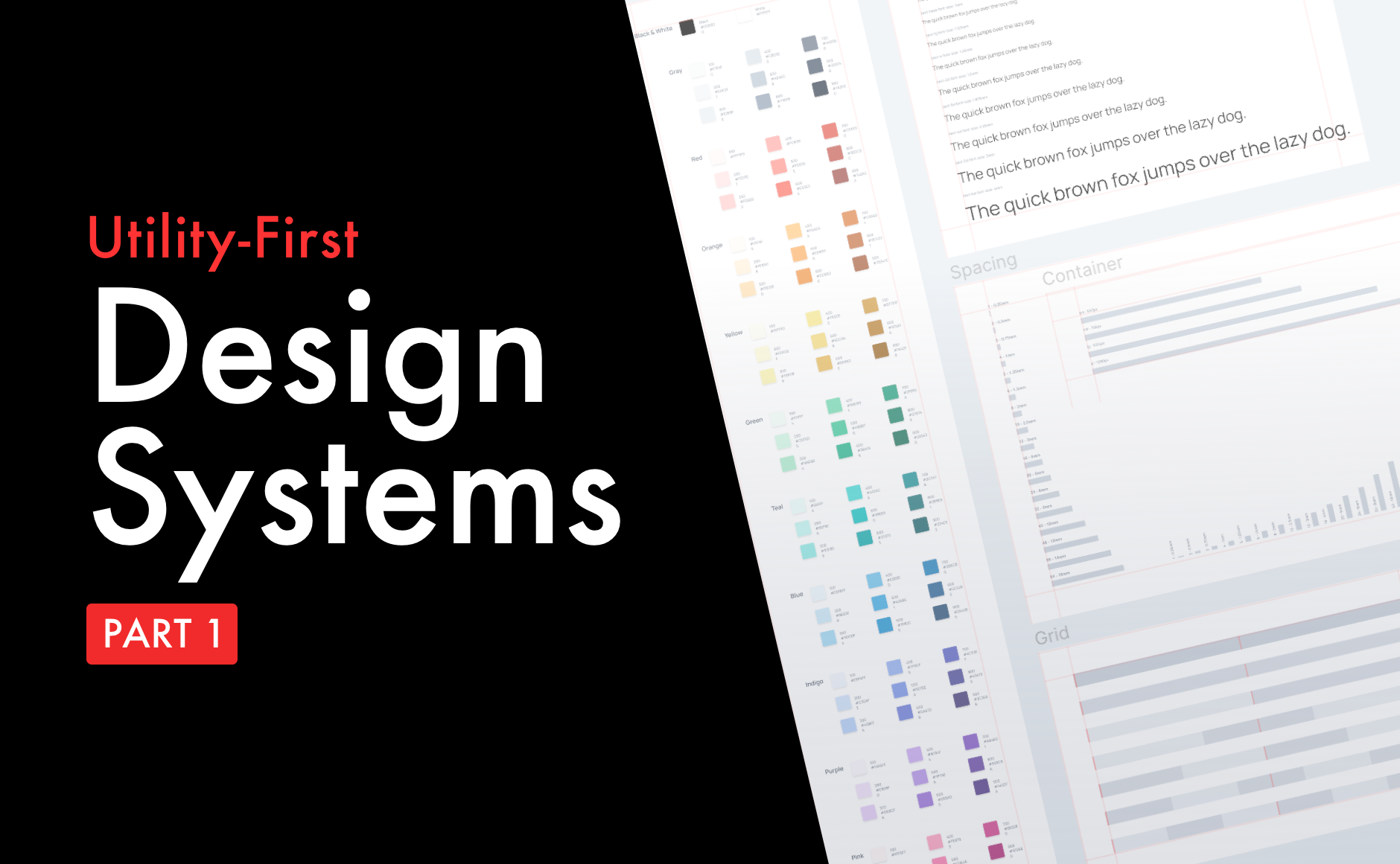
Colors
Colors represent one of the most basic but still fundamental elements of a design system. Following Tailwind's configuration, colors represent the first block that should be outlined as it will a part of every other component we build. Tailwind offers a default color list but you can always override them with your colors. Naming is also your responsibility and I find the convention proposed by Tailwind to be somehow effective.
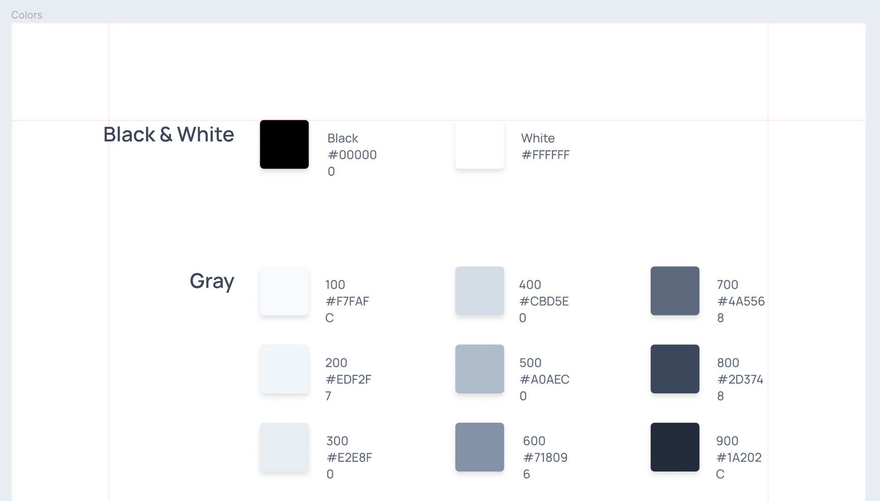
Colors are represented this way in the tailwind.config.js file:
module.exports = {
  theme: {
    colors: {
	  grey-100: '#F7FAFC',
	  grey-200: '#EDF2F7',
	  grey-300: '#E2E8F0',
	  grey-400: '#CBD5E0',
	  grey-500: '#A0AEC0',
    }
  }
}
Screen (breakpoints)
Designing for multiple screens must be a critical part of your product strategy. As each project is unique, you must first define what are the screens the user care most about. Not all projects need a mobile app while others need a mobile-first strategy, so you must study your users to understand what type of devices they will have when using your app. With Tailwind, every utility class can be applied conditionally at different breakpoints, which makes it easier to build complex responsive interfaces without needing media queries.
The default breakpoints provided by Tailwind are inspired by common device resolutions, but you can always customize them or add new ones if needed.
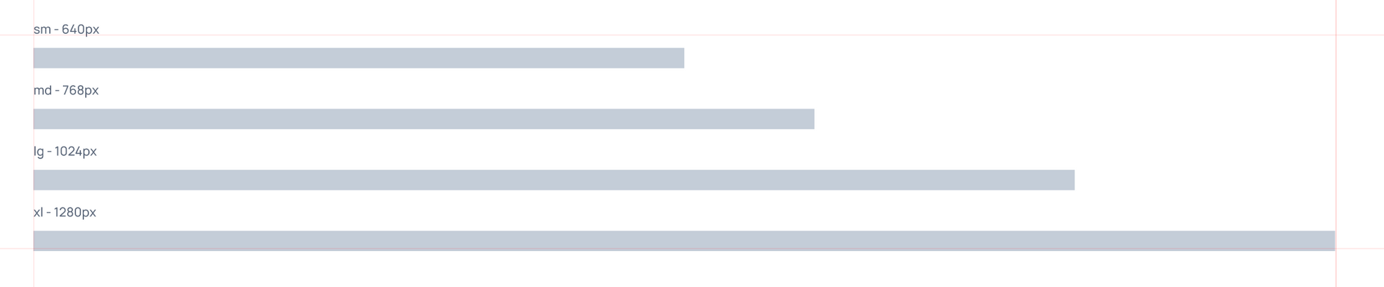
Screens are represented this way in the tailwind.config.js file:
module.exports = {
  theme: {
    screens: {
      'sm': '640px',
      // => @media (min-width: 640px) { ... }

      'md': '768px',
      // => @media (min-width: 768px) { ... }

      'lg': '1024px',
      // => @media (min-width: 1024px) { ... }

      'xl': '1280px',
      // => @media (min-width: 1280px) { ... }

      'xxl': '1600px',
      // => @media (min-width: 1600px) { ... }
    }
  }
}
Spacing
In order to allow a simple mean of controlling margins, paddings, width and height, Tailwind's config include a spacing configuration that generates all the utility classes needed for these elements. By default, Tailwind includes values that are proportional, so 16 is twice as much spacing as 8 for example. One spacing unit is equal to 0.25rem, which translates to 4px by default in common browsers.
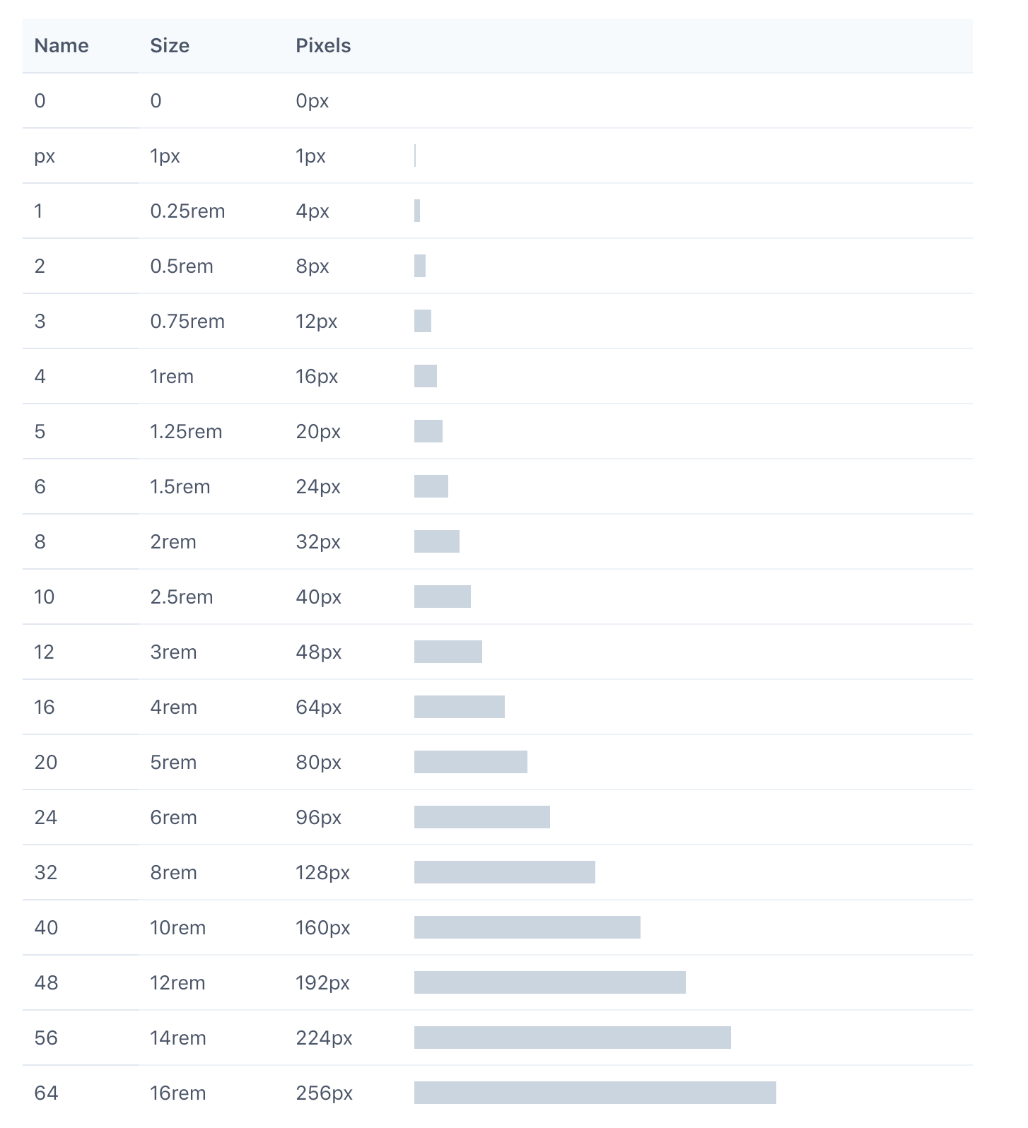
As a designer, you must make sure all your components are made using spacing values included in this list. Spacing is represented this way in the tailwind.config.js file:
module.exports = {
  theme: {
    spacing: {
      '1': '8px',
      '2': '12px',
      '3': '16px',
      '4': '24px',
      '5': '32px',
      '6': '48px',
    }
  }
}
Typography
This sections allows for customization of all the proprieties of your fonts. By default Tailwind provides three font family utilities: a cross-browser sans-serif stack, a cross-browser serif stack, and a cross-browser monospaced stack. You can of course change them in the theme.fontFamily section of your Tailwind config file.
module.exports = {
  theme: {
    fontFamily: {
-     'sans': ['-apple-system', 'BlinkMacSystemFont', ...],
-     'serif': ['Georgia', 'Cambria', ...],
-     'mono': ['SFMono-Regular', 'Menlo', ...],
+     'display': ['Oswald', ...],
+     'body': ['Open Sans', ...],
    }
  }
}
Font size is also an important element of this section and we need to setup the variables that will be included in our design system and the app.
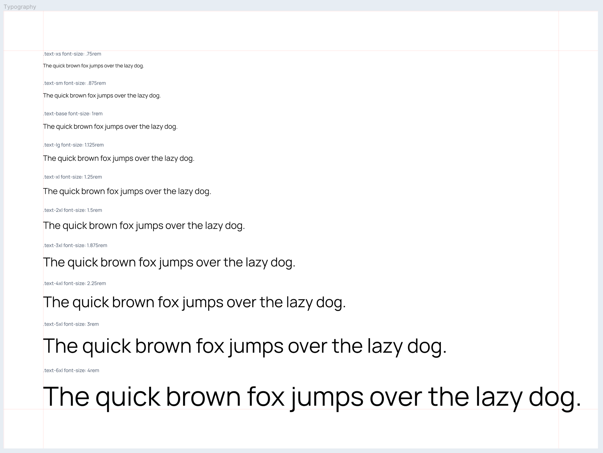
By default, Tailwind provides 10 font-size utilities. You can modify, add, rename or remove them by editing the theme.fontSize section of your Tailwind config.
module.exports = {
  theme: {
    fontSize: {
     'xs': '.75rem',
     'sm': '.875rem',
     'tiny': '.875rem',
     'base': '1rem',
     'lg': '1.125rem',
     'xl': '1.25rem',
     '2xl': '1.5rem',
     '3xl': '1.875rem',
     '4xl': '2.25rem',
     '5xl': '3rem',
     '6xl': '4rem',
     '7xl': '5rem',
    }
  }
}
Other elements
Other sections are of course required to have a comprehensive design system, but we're only providing some examples to illustrate our workflow. In the next chapter, we'll have a use-case example that applies a workflow with the elements mentioned before, but also:
- Layout
- Borders
- Backgrounds
- Tables
- Interactions
- Full components (buttons, cards, forms, navigations...)
Browsing your components
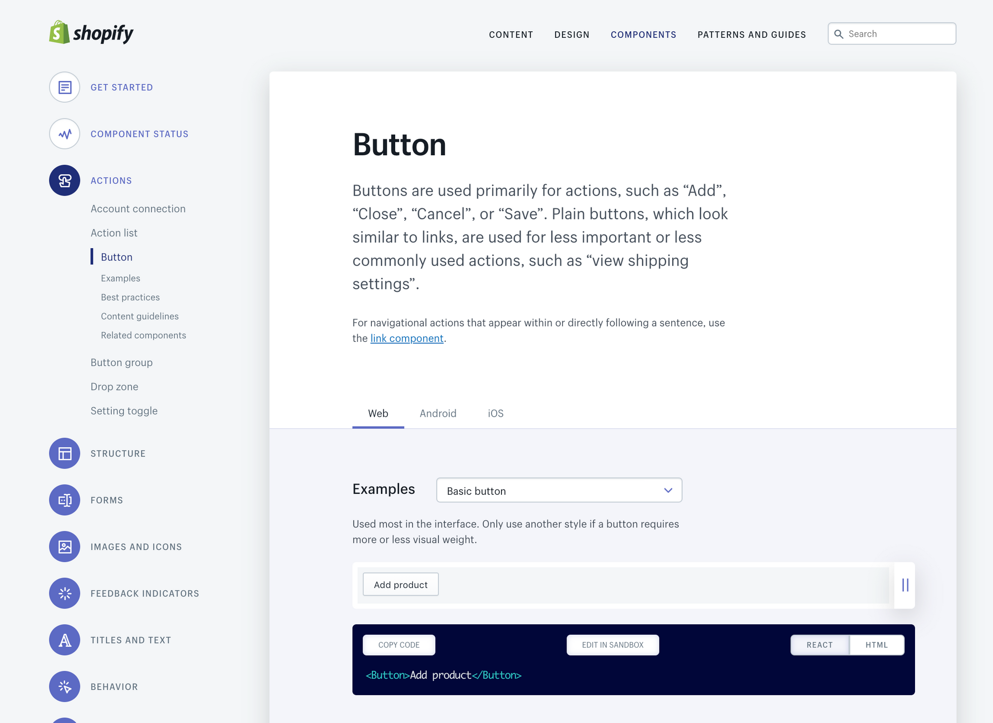
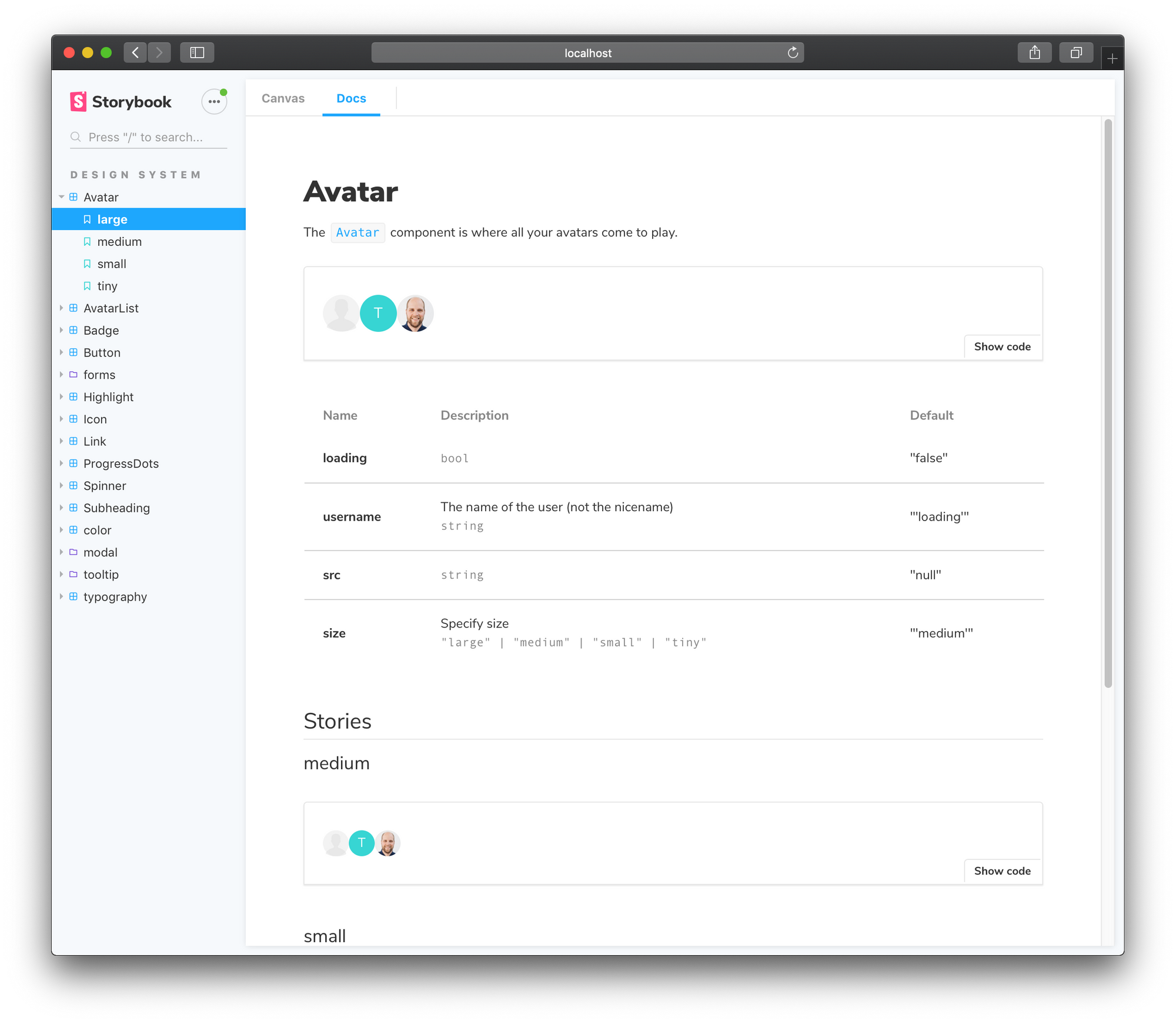
In order to see all the components in a cleared and documented way you can use Storybook for that. It will allow to browse, share and test all the components available on your design system and in your application. It is compatible with ReactJS, VueJS & AngluarJS, Svelte...
Storybooks allows you to create a clean documentation from all your components with a very simple plugin called Storybook Docs:
Conclusion
So to wrap things up, this article should serve as an introduction to building utility-first design systems that are practical, always up to date and allow for a fluid collaboration between the design and tech team. By using the configuration-first approach powered by Tailwind, product teams can improve their work velocity, code quality and make for a more enjoyable collaboration between the designers & developers.
If you have experimented with this approach or have questions about it, don't hesitate to ask me in the comment section below. To end this article, I'll leave you with a quote from Jina Anne, founder of the Clarity Design System Conference, in the excellent InVision podcast:
“Design and engineering should share the ownership of the design system together” - Design Systems Advocate and @Clarity_Conf founder, @jina
— InVision (@InVisionApp) October 17, 2019
Get more insights from Jina Anne in her episode of the #DesignBetter podcast https://t.co/jqGcRQYFGp pic.twitter.com/8y77HJPViR