

Introduction
Modern society has made mobile apps more than just apps; scrolling through our phones for hours has made them a part of our lives and identities. Like food, mobile apps have moved beyond the point of being solely functional. Now we are also concerned about their aesthetics. This brings us to the importance of properly implementing the UIs provided by UI/UX designers. In today’s article we aim to demonstrate how to "cook" a sign-in UI from scratch.
This will be our reference UI: https://www.figma.com/file/nTC07om70lEuFhlseQFZOt/Untitled?node-id=1%3A2&t=lr3qY4i29uKJzccv-1
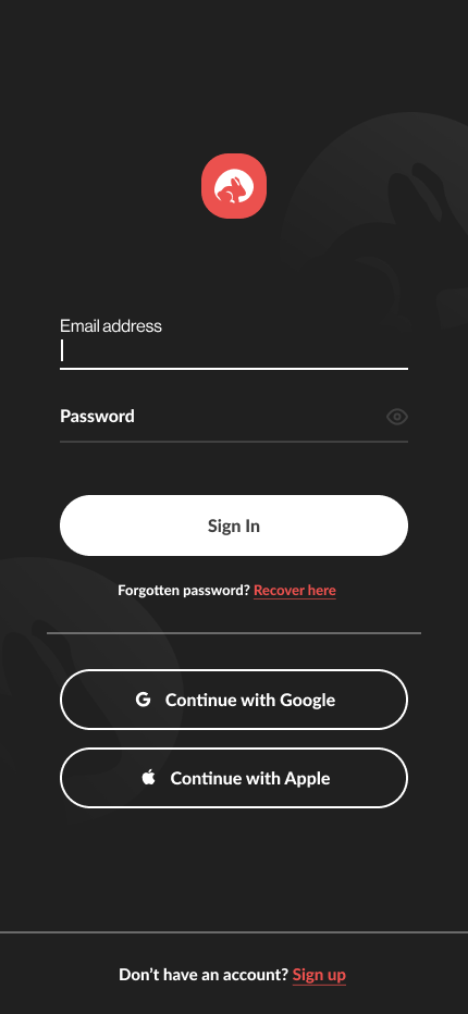
NB: Before we start, the values of the spacing between elements were extracted using the following method [Measure distances between layers – Figma Help Center](https://help.figma.com/hc/en-us/articles/360039956974-Measure-distances-between-layers).
The remaining properties are found on the inspect tab (on the right).
TL;DR
- Implementing the UIs following an atomic design approach makes components easily maintainable
- Making a complex custom input can be tricky
- MutableStates can be managed using onClick and onFocusChanged events to add certain behaviors to components (especially buttons and inputs)
- It is good to follow the design but trust your guts as well
Mise en place
Let’s create a new Project with an Empty Compose Activity, we will call it NWDojo. Once the project is set up, In the MainActivity.kt file we will start creating our components as composable methods.
Drawables, colors, and fonts
For resources, you will find them in the following URL: https://drive.google.com/drive/folders/1nudWph2c8zzxL2ozJ49oCboBdyjsh-AV?usp=sharing
Download it and replace your current res folder with the one from Google Drive. Then go to Type.kt file in ui.theme package. and add this block before the declaration of Typography
val Lato = FontFamily(
	Font(R.font.lato_regular),
	Font(R.font.lato_bold,FontWeight.Bold),
	Font(R.font.lato_light, FontWeight.Light),
	Font(R.font.lato_thin, FontWeight.Thin),
	Font(R.font.lato_black, FontWeight.Black),
)
Background
For the background, we will use the Composable Image() and give it as a parameter a painter generated from our background.xml drawable.
@Composable
fun Background() {
		Image(painter =painterResource(id = R.drawable.background),
        contentDescription = "background",
        contentScale = ContentScale.Crop,
        modifier = Modifier.fillMaxSize()
    )
}
for contentScale, I preferred using Crop to not distort the images and yet fill the maximum for both the height and the width.
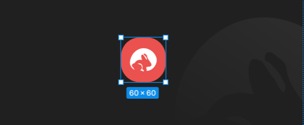
Logo
We add an image and define its size to 60dp, it will be our logo
@Composable
fun Logo(){
    Image(
        painterResource(R.drawable.ic_nimbleways),
        contentDescription = "Logo",
        contentScale = ContentScale.Crop,
        modifier = Modifier.size(60.dp)
    )
}
Buttons
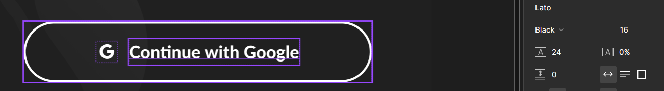
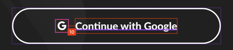
The default compose Button allows adding onClick events, but when it comes to the content, it’s up to the developer to add it and style it the way he likes. In this screen, we notice that we have 2 parameters that change: the Icon, and the button filling.
First, we are going to add a button with simple text, from there we will add more.
@Composable
fun CustomButton(){
		Button(onClick ={/*TODO*/}){
				Text("Button")
		}
}
Now we will make the button fill the whole width of the parent, change its shape to a RoundedCornerShape with a radius of 60dp, then add a 2dp white stroke.
@Composable
fun CustomButton(){
		Button(
        onClick = { /*TODO*/ },
        shape = RoundedCornerShape(60.dp),
        border = BorderStroke(2.dp, colorResource(id = R.color.white)),
        modifier = Modifier
            .height(56.dp)
            .fillMaxWidth())
		{
			Text("Button")
		}
}
It’s time to remove the background color based on if the button is filled or not. We will add a parameter filled (Boolean) with a default value false, add a variable “colors” which we will initiate to transparent then add a condition to update colors value to white.
@Composable
fun CustomButton(filled:Boolean = false){
    var colors = ButtonDefaults.buttonColors(backgroundColor = Color.Transparent)
    if(filled){
	        colors = ButtonDefaults.buttonColors(backgroundColor =colorResource(id = R.color.white))
    }
		Button(
        onClick = { /*TODO*/ },
        shape = RoundedCornerShape(60.dp),
        border = BorderStroke(2.dp, colorResource(id = R.color.white)),
        modifier = Modifier
            .height(56.dp)
            .fillMaxWidth(),
        colors = colors)
		{
			Text("Button")
		}
}
We are going to add a parameter to our function to pass the button text, then we will change the color of our text based on if the button is filled or transparent. We will also change the size of the font to 14sp, set the fontFamily to Lato and the fontWeight to Black, then remove the default letter spacing of the Button element by setting it to 0sp.
@Composable
fun CustomButton(filled:Boolean = false, text:String = "Button"){
    var colors = ButtonDefaults.buttonColors(backgroundColor = Color.Transparent)
    var textColor = colorResource(R.color.white)
    if(filled){
        colors = ButtonDefaults.buttonColors(backgroundColor = colorResource(id = R.color.white))
        textColor = colorResource(R.color.grey_700)
    }
    Button(
        onClick = { /*TODO*/ },
        shape = RoundedCornerShape(60.dp),
        border = BorderStroke(2.dp, colorResource(id = R.color.white)),
        modifier = Modifier
            .height(56.dp)
            .fillMaxWidth(),
        colors = colors))
    {
        Text(text,
            color=textColor,
            fontSize = 14.sp,
            fontWeight = FontWeight.Black,
            letterSpacing= 0.sp,
            fontFamily = Lato
        )
    }
}
The button is getting into shape now, one remaining thing is the icon. We are going to add a parameter of type Painter? to pass our icon. We will also add a check if the icon param is not null before showing it.
@Composable
fun CustomButton(filled:Boolean = false, icon: Painter? = null, text:String = "Continue with Apple"){
    var colors = ButtonDefaults.buttonColors(backgroundColor = Color.Transparent)
    var textColor = colorResource(R.color.white)
    if(filled){
        colors = ButtonDefaults.buttonColors(backgroundColor = colorResource(id = R.color.white))
        textColor = colorResource(R.color.grey_700)
    }
    Button(
        onClick = { /*TODO*/ },
        shape = RoundedCornerShape(60.dp),
        border = BorderStroke(2.dp, colorResource(id = R.color.white)),
        modifier = Modifier
            .height(56.dp)
            .fillMaxWidth(),
        colors = colors)
    {
        if(icon != null){
            Icon(painter = icon,
                tint= textColor,
                contentDescription = "")
            Spacer(modifier = Modifier.width(10.dp))
        }
        Text(text,
            color=textColor,
            fontSize = 16.sp,
            fontWeight = FontWeight.Black,
            letterSpacing= 0.sp,
            fontFamily = Lato
        )
    }
}
To wrap up with our button let’s pass an onClick parameter of type ()->Unit, we will default it as {}. This way we can pass the action to each button when we declare it.
@Composable
fun CustomButton(filled:Boolean = false, icon: Painter? = null, text:String = "Continue with Apple", onClick: ()->Unit = {}){
    var colors = ButtonDefaults.buttonColors(backgroundColor = Color.Transparent)
    var textColor = colorResource(R.color.white)
    if(filled){
        colors = ButtonDefaults.buttonColors(backgroundColor = colorResource(id = R.color.white))
        textColor = colorResource(R.color.grey_700)
    }
    Button(
        onClick = onClick,
        shape = RoundedCornerShape(60.dp),
        border = BorderStroke(2.dp, colorResource(id = R.color.white)),
        modifier = Modifier
            .height(56.dp)
            .fillMaxWidth(),
        colors = colors)
    {
        if(icon != null){
            Icon(painter = icon,
                tint= textColor,
                contentDescription = "")
            Spacer(modifier = Modifier.width(10.dp))
        }
        Text(text,
            color=textColor,
            fontSize = 16.sp,
            fontWeight = FontWeight.Black,
            letterSpacing= 0.sp,
            fontFamily = Lato
        )
    }
}
LinkText
The linkText here refers to the 'Forgotten password' and 'Sign up' text. We will start by adding a row, that will fit both texts, then add the Text composables and customize them following the Figma design
@Composable
fun LinkText(){
    Row(
        verticalAlignment = Alignment.CenterVertically,
        horizontalArrangement = Arrangement.Center
    ) {
        Text("Text",
            color = colorResource(R.color.white),
            fontWeight = FontWeight.Black,
            fontSize = 14.sp,
            fontFamily = Lato
        )
        Text("link",
            color = colorResource(R.color.orange_700),
            fontWeight = FontWeight.Black,
            textDecoration = TextDecoration.Underline,
            fontFamily = Lato,
            fontSize = 14.sp
        )
    }
}
As we see on the UI, the fonts are of different sizes, let’s extract and make it a param with a default value of 14sp. We will also extract the text values for both parts, make the second clickable and add a spacer between them.
@Composable
fun LinkText(text:String = "Text",linkText:String = "linkText",fontSize: TextUnit = 14.sp, onClick:()-> Unit= {}){
    Row(
        verticalAlignment = Alignment.CenterVertically,
        horizontalArrangement = Arrangement.Center,
    ) {
        Text(text,
            color = colorResource(R.color.white),
            fontWeight = FontWeight.Bold,
            fontSize = fontSize,
            fontFamily = Lato
        )
        if(text.isNotBlank() && linkText.isNotBlank()){
            Spacer(modifier = Modifier.width(3.dp))
        }
        Text(
            modifier = Modifier.clickable(
                enabled = true,
                onClick = onClick
        ),
            text = linkText,
            color = colorResource(R.color.orange_700),
            fontWeight = FontWeight.Bold,
            textDecoration = TextDecoration.Underline,
            fontFamily = Lato,
            fontSize = fontSize
        )
    }
}
StyledTextField
Since the default TextField Composable isn’t so customizable and doesn’t align with the design we have, we will need to use the BasicTextField and build upon it, which might be a little bit of extra work but it also means that we can customize the layout to its fullest.
Let’s start by creating a composable function StyledTextField and call the BasicTextField with the default arguments inside it.
@Composable
fun StyledTextField(value: TextFieldValue = TextFieldValue(""),onValueChange:(TextFieldValue)->Unit = {}){
    BasicTextField(value = value, onValueChange = onValueChange)
}
The decoration box attribute is the one responsible for the UI of the Basic text field, it takes a composable function as Value and passes to it a composable innerTextField which represents typing area.
We will start by defining the height of the textField when expanded and fix it on that value, we will also force the vertical arrangement to be at the bottom, this way, when the label moves up it won’t impact the whole screen, then we are going to add the text style and cursor color to it.
@Composable
fun StyledTextField(value: TextFieldValue = TextFieldValue(""),onValueChange:(TextFieldValue)->Unit = {}) {
    BasicTextField(
        cursorBrush = SolidColor(colorResource(id = R.color.white)),
        textStyle = TextStyle(
            color = colorResource(id = R.color.white),
            fontSize =  16.sp,
            fontFamily = Lato,
            fontWeight = FontWeight.Normal@Composable
        ),
        value = value,
        onValueChange = onValueChange,
        decorationBox = { innerTextField ->
            Column(
                verticalArrangement = Arrangement.Bottom,
                modifier = Modifier
                    .fillMaxWidth()
                    .height(51.dp)
            )
            {
                innerTextField()
                Divider(color = colorResource(R.color.white), thickness = 2.dp)
            }
        })
}
This TextField will also be used for the password, so let’s add the visibility icon and onClick behavior to apply the visual transformation.
When I was testing the UI, I found out that if I stick to the bottom padding provided on the Design, the text appears at a lower level than the visibility icon which didn’t look appealing.
NB: As phones sometimes render some components (fonts mostly) differently than on design apps, which might cause some incoherences in the design, you should rely on your judgment, and put yourself in the shoes of the end-user and what would look better between your hands.
@Composable
fun StyledTextField(
    value: TextFieldValue = TextFieldValue(""),
    onValueChange:(TextFieldValue)->Unit = {},
    isPassword:Boolean = false
) {
    var isPasswordVisible  by remember { mutableStateOf(false) }
    BasicTextField(
        cursorBrush = SolidColor(colorResource(id = R.color.white)),
        textStyle = TextStyle(
            color = colorResource(id = R.color.white),
            fontSize =  16.sp,
        ),
        value = value,
        onValueChange = onValueChange,
        visualTransformation = if (!isPasswordVisible && isPassword) PasswordVisualTransformation() else VisualTransformation.None,
        decorationBox = { innerTextField ->
            Column(
                verticalArrangement = Arrangement.Bottom,
                modifier = Modifier
                    .fillMaxWidth()
                    .height(51.dp)
            )
            {
                Row(
                    verticalAlignment = Alignment.Bottom,
										modifier = Modifier
                        .fillMaxHeight().weight(1f)
                ){
                    Column(
                        modifier = Modifier
                            .fillMaxWidth()
                            .weight(1f)
                    ){
                        innerTextField()
                    }
                    if (isPassword) {
                        var painter = painterResource(id = R.drawable.ic_visibility_off)
                        var tint = colorResource(id = R.color.white)
                        if (isPasswordVisible) {
                            painter = painterResource(id = R.drawable.ic_visibility)
                        }
                        if(!value.text.isEmpty()){
                            painter = painterResource(id = R.drawable.ic_visibility)
                            tint = colorResource(id = R.color.grey_600)
                        }
                        Spacer(modifier = Modifier.width(10.dp))
                        IconButton(onClick = { isPasswordVisible = !isPasswordVisible }, modifier = Modifier.width(20.dp)) {
                            Column(modifier = Modifier
                                .fillMaxHeight(), verticalArrangement = Arrangement.Bottom) {
                                Icon(
                                    painter = painter,
                                    modifier = Modifier
                                        .width(20.dp)
                                        .padding(bottom = 12.dp),
                                    tint = tint,
                                    contentDescription = "",
                                )
                            }
                        }

                    }
                }
                Divider(color = colorResource(R.color.white), thickness = 2.dp)
            }
        })
}
Now to finish up TextField, we should add the label and move it so as change the colors based on the focus state.
@Composable
fun StyledTextField(
    value: TextFieldValue = TextFieldValue(""),
    onValueChange:(TextFieldValue)->Unit = {},
    isPassword:Boolean = true,
    label:String = "Label"
) {
    var dividerColor by remember { mutableStateOf(R.color.grey_600) }
    var isFocused  by remember { mutableStateOf(false) }
    var isPasswordVisible  by remember { mutableStateOf(false) }
    var textHeight  by remember { mutableStateOf(30.dp) }

    BasicTextField(
        cursorBrush = SolidColor(colorResource(id = R.color.white)),
        textStyle = TextStyle(
            color = colorResource(id = R.color.white),
            fontSize =  16.sp,
            fontFamily = Lato,
            fontWeight = FontWeight.Normal
        ),
        modifier = Modifier
            .height(51.dp)
            .focusTarget()
            .onFocusChanged { focusState ->
                isFocused = focusState.hasFocus
                if (focusState.hasFocus) {
                    dividerColor = R.color.white
                    textHeight = 49.dp
                } else {
                    dividerColor = R.color.grey_600
                    if (value.text.isEmpty()) {
                        textHeight = 30.dp
                    }
                }
            },
        value = value,
        onValueChange = onValueChange,
        visualTransformation = if (!isPasswordVisible && isPassword) PasswordVisualTransformation() else VisualTransformation.None,
        decorationBox = { innerTextField ->
            Column(
                verticalArrangement = Arrangement.Bottom,
                modifier = Modifier
                    .fillMaxWidth()
                    .height(51.dp)
            )
            {
                Row(
                    verticalAlignment = Alignment.Bottom,
                    modifier = Modifier
                        .fillMaxHeight()
                        .weight(1f)
                ){
                    Column(
                        modifier = Modifier
                            .height(textHeight)
                            .fillMaxWidth()
                            .weight(1f)
                            .padding(bottom = 2.dp)
                    ){
                        if (isFocused || !value.text.isEmpty() ) {
                            Text(text = label,
                                modifier = Modifier
                                    .height(20.dp)
                                    .padding(bottom = 3.dp),
                                fontFamily = Lato,
                                fontSize = 13.sp
                            )
                            Spacer(modifier = Modifier.height(2.dp))
                        }else {
                            Text(
                                text = label,
                                fontSize = 16.sp,
                                fontFamily = Lato,
                                fontWeight = FontWeight.Black
                            )
                        }
                        innerTextField()
                    }
                    if (isPassword) {
                        var painter = painterResource(id = R.drawable.ic_visibility_off)
                        var tint = colorResource(id = R.color.white)
                        if(value.text.isEmpty()){
                            tint = colorResource(id = R.color.grey_600)
                        }
                        if (isPasswordVisible) {
                            painter = painterResource(id = R.drawable.ic_visibility)
                        }
                        Spacer(modifier = Modifier.width(10.dp))
                        IconButton(onClick = { isPasswordVisible = !isPasswordVisible }, modifier = Modifier.width(20.dp)) {
                            Column(modifier = Modifier
                                .fillMaxHeight(), verticalArrangement = Arrangement.Bottom) {
                                Icon(
                                    painter = painter,
                                    modifier = Modifier
                                        .width(20.dp)
                                        .padding(bottom = 6.dp),
                                    tint = tint,
                                    contentDescription = "",
                                )
                            }
                        }

                    }
                }
                Divider(color = colorResource(R.color.white), thickness = 2.dp)
            }
        })
}
Cooking
In the UI, we can notice that we have 4 main blocks:
- Logo
- Login form
- Social login buttons
- Footer

For the logo, we are going to use the component in its current form.
let’s cook the rest of the compositions using the components we have made before.
Login Form
The login form contains 2 text fields, a button and a textLink which are structured in a column and have the same width. I’ll make them take a fraction of the width of the parent.
@Composable
fun LoginForm(widthFraction: Float = 1f){
    var email by remember { mutableStateOf(
        mutableStateOf(TextFieldValue(""))) }
    var password by remember { mutableStateOf(
        mutableStateOf(TextFieldValue(""))) }
    Column(
        modifier= Modifier.fillMaxWidth(widthFraction),
        horizontalAlignment = Alignment.CenterHorizontally
    ){
        StyledTextField(
            value=email.value,
            isPassword = false,
            label = "Email address",
            onValueChange = {
            email.value = it
        })
        Spacer(modifier = Modifier.height(16.dp))
        StyledTextField(
            value=password.value,
            isPassword = true,
            label = "Password",
            onValueChange = {
            password.value = it
        })
        Spacer(modifier = Modifier.height(48.dp))
        CustomButton(filled = true,text="Sign in")
        Spacer(modifier = Modifier.height(24.dp))
        LinkText(text = "Forgotten Password? ", linkText = "Recover here", fontSize = 13.sp)
    }
}
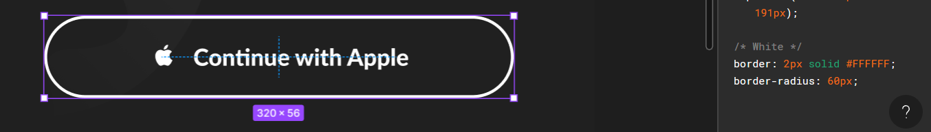
Social login buttons
For the social login buttons, we will call our Composable function and pass the icons ic_google_logo and ic_apple as a Painter, and we will add a space with 16dp height, then give it 12dp of horizontal padding
@Composable
fun SocialLogin(){
    var email by remember { mutableStateOf(
        mutableStateOf(TextFieldValue(""))) }
    var password by remember { mutableStateOf(
        mutableStateOf(TextFieldValue(""))) }
    Column(
        modifier= Modifier
            .fillMaxWidth()
            .padding(horizontal = 12.dp),
        horizontalAlignment = Alignment.CenterHorizontally
    ){
        CustomButton(text="Continue with Google", icon = painterResource(id = R.drawable.ic_google_logo))
        Spacer(modifier = Modifier.height(16.dp))
        CustomButton(text="Continue with Apple", icon = painterResource(id = R.drawable.ic_apple))
    }
}
Footer
The footer can be seen as a column with a fixed height of 76dp containing a divider and a LinkText component.
@Composable
fun Footer(){
    Column(modifier = Modifier
        .fillMaxWidth()
        .height(76.dp),
        horizontalAlignment = Alignment.CenterHorizontally
    ) {
        Divider(color = colorResource(R.color.grey_200), thickness = 2.dp)
        Column(
            modifier = Modifier.fillMaxHeight().weight(1f),
            verticalArrangement = Arrangement.Center
        ) {
            LinkText(text = "Don't have an account? ", linkText = "Sign up", fontSize = 15.sp)
        }
    }
}
Assembly
Now that our blocks are ready, all we have left is to assemble the UI.
Start by creating a function named Body that will contain the Logo and a Column wrapping the form and social login buttons.
@Composable
fun Body(){
    Logo()
    Column() {
        LoginForm()
        Spacer(modifier = Modifier.height(32.dp))
        Divider(color = colorResource(R.color.grey_200), thickness = 2.dp)
        Spacer(modifier = Modifier.height(32.dp))
        SocialLogin()
    }
}
Now, we add a method Screen that will hold all our UI and we are going to set it as content on the OnCreate Method.
Inside Screen, we add a card and call the Background() component inside it, then add a Column that will hold our foreground components, and call the Footer inside it
override fun onCreate(savedInstanceState: Bundle?) {
    super.onCreate(savedInstanceState)
    setContent {
        NWDojoTheme {
            // A surface container using the 'background' color from the theme
            Surface(
                modifier = Modifier.fillMaxSize(),
                color = MaterialTheme.colors.background
            ) {
                Screen()
            }
        }
    }
}
@Composable
fun Screen(){
    Card(shape = RectangleShape, elevation = 0.dp, modifier = Modifier.fillMaxSize()) {
        Background()
        Column(modifier = Modifier.fillMaxSize()) {
            Footer()
        }
    }
}
For the column inside Screen, we will add inside it another Column, this one will wrap our body method, and we will make it fill the remaining height, give it 90% of the parent width and add center horizontal alignment to its parent.
NB: Even though adding this latest column to Body sounds plausible but the usage of the Modifier.weight method requires a RowScope, which means we will need another Column to wrap it and we will be obliged to call Footer inside the Body.
@Composable
fun Screen(){
    Card(shape = RectangleShape, elevation = 0.dp, modifier = Modifier.fillMaxSize()) {
        Background()
        Column(modifier = Modifier.fillMaxSize(), horizontalAlignment = Alignment.CenterHorizontally) {
            Column(
                modifier = Modifier
                    .fillMaxHeight()
                    .fillMaxWidth(0.9f)
                    .weight(1f),
                verticalArrangement = Arrangement.SpaceEvenly,
                horizontalAlignment = Alignment.CenterHorizontally
            ) {
                Body()
            }
            Footer()
        }
    }
}

This is the result we got compared to the original design:
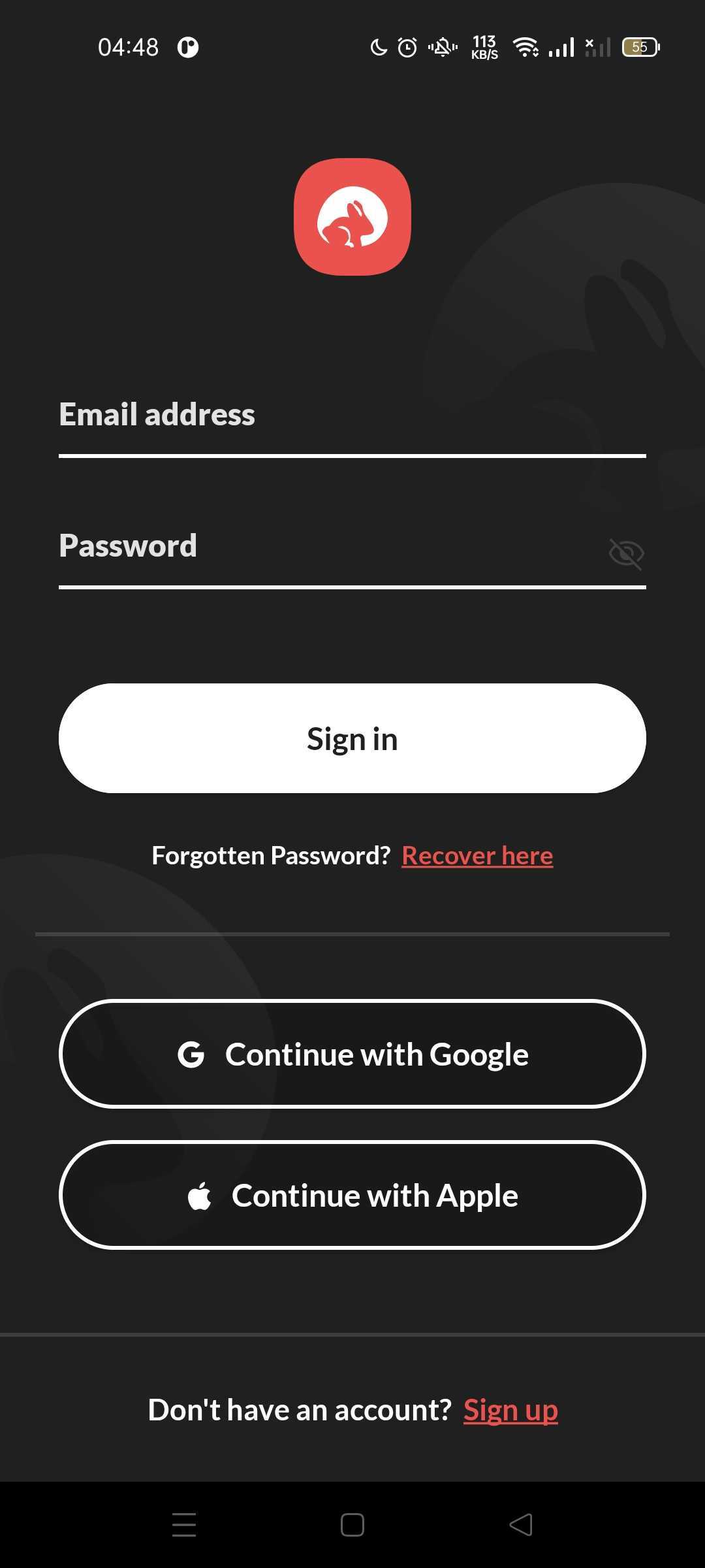

As we are developing an app for devices of multiple sizes, the overall look of the app can seem slightly different from the original design on some of them.
Conclusion
By decomposing our UI and exploiting the Jetpack Compose flexibility, we managed to build our screen from the ground up, customize a BasicTextField and understood its limitations, and finally handle mutable states through onClick and onFocusChanged events.
To ensure the efficiency of the Compose layouts, we will learn how to integrate and test them in future articles.
Implementing UIs from design can be tricky especially if the design wasn’t executed correctly, and it might impact the user experience drastically. I hope this allowed you to practice customizing Compose components following a Figma design and gave you an idea of to what extent customization is allowed.
Thank you for reading, and Bon Appetit.