

As front-end developers, we spend a lot of time creating components and layouts with CSS.
But every time we modify a component, we are only interested in doing unit tests to make sure the component is working properly, and we often forget to test the layout and make sure everything remains visually intact.
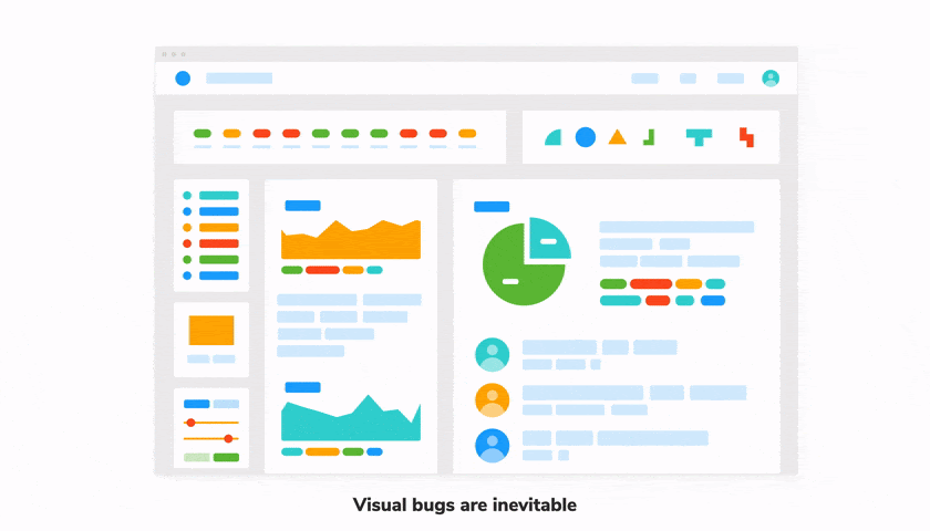
Visual tests have gained popularity recently as they offer the possibility of providing bug-free user interfaces. In the past, developers used snapshots and unit tests to scan for bugs in blobs of HTML. But those methods could not represent what the user actually sees, so bugs never went away.
Before we start, let's first understand what are visual bugs and visual testing?
Visual bugs
Visual bugs are unintentional errors that sneak into your UI. These are regressions that are easy to eyeball, but common testing methods cannot detect them.
This leads us to ask these 2 questions every time we make a change in our components :
-Does it look right?
-Does it still look right?
And that's why we need visual tests.
Visual testing
Visual testing allows you to answer these questions with one unified workflow. It's the process of verifying the appearance of your component as you’re building it.
And here is the Visual Test workflow:
- 🏷 Isolate components with Storybook and test one component at a time.
- ✍🏽 Write the test cases. Each test represents the component in a different state using props and mock data.
- 🔍 Manually verify the representation of each state
- 📸 Detect UI bugs automatically by comparing to a screenshot of the “last known good state”
Let's go through each step in detail in a simple tutorial.
Tutorial
In this tutorial, we're going to use this page as an example:
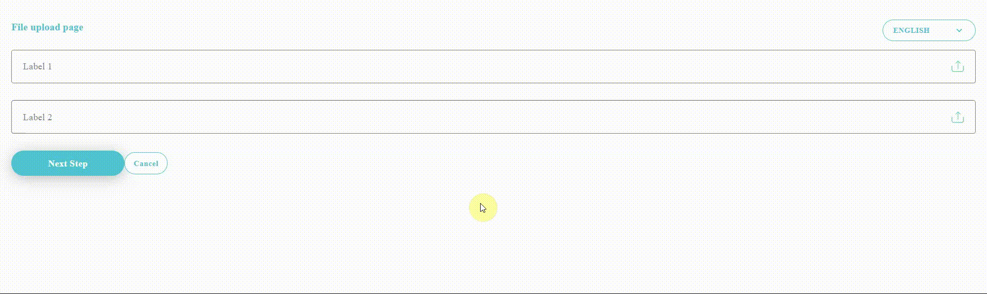
It's a file uploader page that contains 3 components: a dropdown, a file uploader, and a button.
You can follow along by cloning this repo : https://github.com/10Zakaria10/StoryBook-Tutorial
And as you can see each component have its own state and behavior, so it would be nice if we can test each case in isolation.
1. Isolate components
It’s much easier to detect bugs by testing one component at a time and writing a test case for each of its states.
The easiest way is to build and test the component on the application page where it is first used. Which makes it hard to simulate and verify all its states. But there’s a better way ⇒ Storybook.
Storybook is a tool for exploring components and building them in isolation. And we're going to use it to demonstrate visual testing.
It is packaged as a small standalone tool that lives alongside your app, giving you the possibility to :
- 📥 Render each component in isolation
- 🔭 See the representation of each state as stories
- 📜 Show usage guidelines for each component
- 📚 Provide documentation for components props
- 🗃️ Package the components to make them easy to discover
Let's try to isolate each of these components by themselves.
For that, we need Storybook.
Setup Storybook
We first need to execute this command:
npx sb init
During its installation process, Storybook will look into your project's dependencies and provide you with the best configuration available.
The command above will make the following changes to your local environment:
- 📦 Install the required dependencies.
- 🛠 Setup the necessary scripts to run and build Storybook.
- 🛠 Add the default Storybook configuration.
- 📝 Add some boilerplate stories to get you started.
We need now to create stories for our components to register them in Storybook.
A story is just a function that describes how to render the component in question.
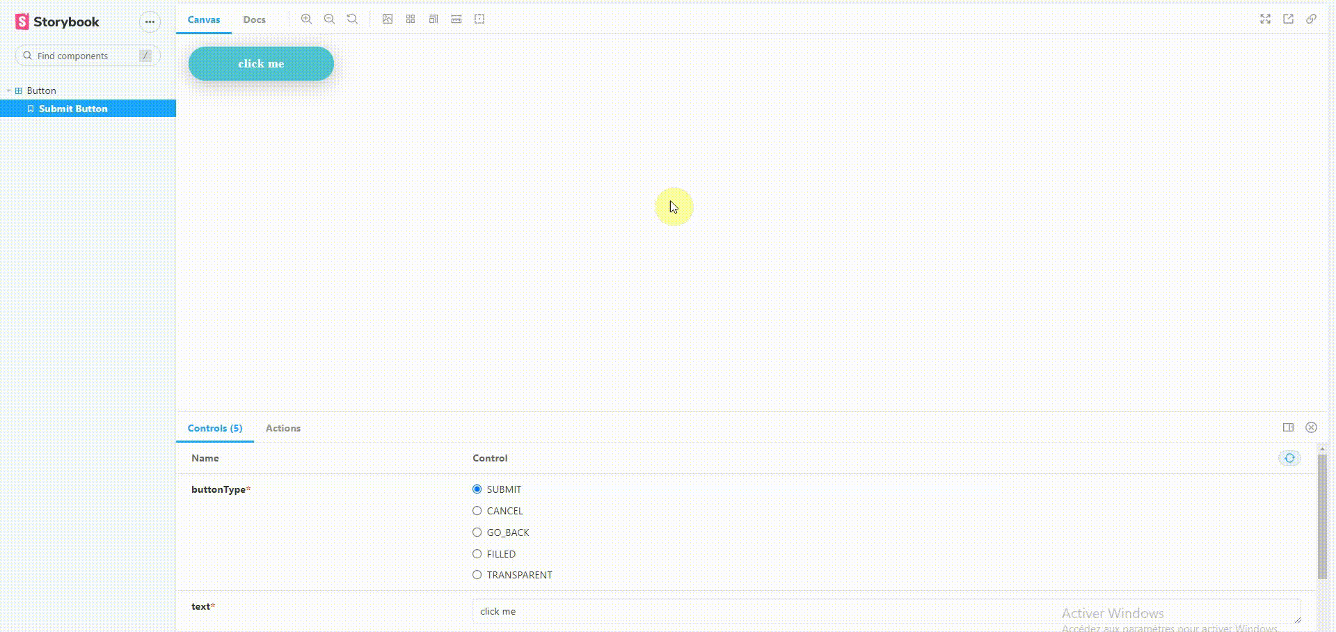
To make it simple, we will only work on the button component and this is what the Button component story looks like in the "Submit" state.
// Button.stories.tsx
import React from 'react';
import { ComponentStory, ComponentMeta } from '@storybook/react';
import Button, { ButtonType } from '../components/Button';

export default {
  title: 'Button',
  component: Button,
} as ComponentMeta<typeof Button>;

const Template: ComponentStory<typeof Button> = (args) => <Button {...args} />;

export const SubmitButton = Template.bind({});
SubmitButton.args = {
  buttonType: ButtonType.SUBMIT,
  text: 'click me ',
};
⚠️ The stories are written in Component Story Format (CSF)--an ES6 modules-based standard--for writing component examples.
Note that Template.bind({}) is a standard JavaScript technique for making a copy of a function. We copy the Template so each exported story can set its own properties on it.
You can also add documentation to your props, for example, let's document Button component props
import React from 'react';

export interface Props {
  /**
   * Each type of button corresponds to a specific design
   */
  buttonType: ButtonType;
  /**
   * Button Text
   */
  text: string;
  /**
   * Function that occurs when the user clicks the button.
   */
  onClick?: (e: MouseEvent) => void;
  /**
   * To make the button disabled
   */
  isDisabled?: boolean;
  /**
   * To show a loader instead of text
   */
  isLoading?: boolean;
  /**
   * Icon that appears before the text
   */
  startIcon?: JSX.Element;
}
const Button: React.FunctionComponent<Props> = ({
.
.
.
export default Button;
And finally, run the following command to start Storybook.
yarn storybook
You should see the Button component load up with a playground for testing different cases and reading the component props documentation.
2. Write test cases
Button component can have different forms and states like Loading, Disabled, Default or maybe a text with icon. Let's add a story for each one.
import React from 'react';
import { ComponentStory, ComponentMeta } from '@storybook/react';
import Button, { ButtonType } from '../components/Button';
import { Search as SearchIcon} from '@material-ui/icons';

export default {
  title: 'Button',
  component: Button,
} as ComponentMeta<typeof Button>;

const Template: ComponentStory<typeof Button> = (args) => <Button {...args} />;

export const DefaultButton = Template.bind({});
DefaultButton.args = {
  buttonType: ButtonType.SUBMIT,
  text: 'click me ',
};

export const LoadingButton = Template.bind({});
LoadingButton.args = {
  buttonType: ButtonType.SUBMIT,
  text: 'click me ',
  isLoading: true,
};

export const DisabledButton = Template.bind({});
DisabledButton.args = {
  buttonType: ButtonType.SUBMIT,
  text: 'click me ',
  isDisabled: true,
};

export const ButtonWithStartIcon = Template.bind({});
ButtonWithStartIcon.args = {
  buttonType: ButtonType.SUBMIT,
  text: 'click me ',
  startIcon: <SearchIcon />,
};
3. Manual verification
Storybook is running in watch mode, so every time you change something inside the source folder, Storybook makes a rebuild. You can now go and see if you're component is matching what you're expecting.
Writing stories brings up scenarios that you wouldn't have considered when developing them, for example, what happens if the text in the Button component is really long.
You can add a story for this, and whenever you change something in your code, you need to manually check your components in Storybook to see if they still look good.
But this action can be very repetitive. It’s unrealistic to manually test all of your components every time you make a change.
That's why Storybook team came up with a visual testing tool called Chromatic
4. Catch UI bugs automatically with Chromatic.
Chromatic is a visual testing tool that checks for regressions automatically. He captures an image snapshot of every story as it appears in the browser. Then whenever you make a modification, a new snapshot is captured and compared to the previous one. You then review any visual differences or variations found to decide if they are intentional updates or accidental bugs.
Setup Chromatic
Chromatic is a cloud-based solution, so you need to Sign in to create a new project and grab your project token.
Then run this command to get Chromatic package:
npm install --save-dev chromatic
and finally, publish your Storybook:
npx chromatic --project-token=<project-token>
The first run will be set as the starting point or the baseline. And each story has a starting point.
On each commit, new snapshots are generated and compared to previous baselines to detect UI changes. Let's see this check-in action.
First, we're going to make a tweak in our button component, let's make the padding smaller.
In Button.style.js file. Update BaseButton to this:
// Button.style.ts
export const BaseButton = styled(Button)<ButtonProps>`
  && {
    ${({ buttontype, direction }: ButtonProps) =>
      getStyledButton(buttontype, direction)};
    text-align: center;
    text-transform: none;
    padding: 10px 20px; //old value is 10px 50px
  }
`;
Run Chromatic command and you’ll see the difference.
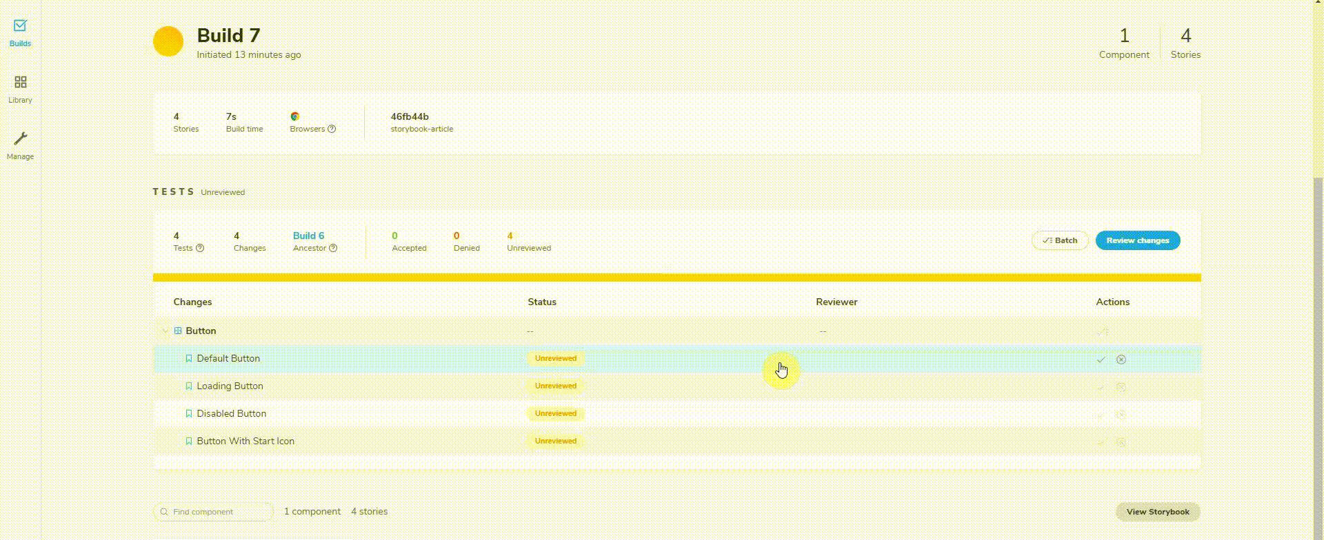
Regression testing ensures that we don’t introduce UI bugs unintentionally. But it’s up to you to decide whether these changes are intentional or not.
✅ If it's intentional, press accept. The baseline will be set as the new snapshot.
❌ If it's not, press deny. The build will fail. Fix the bug and run Chromatic again.
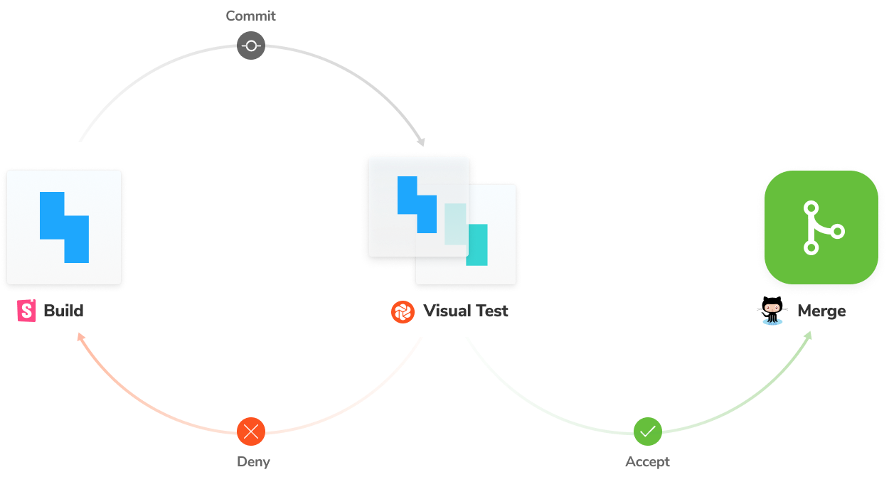
The entire process is illustrated in the diagram below. The handbook covers more details about using Github Actions to trigger this workflow on each commit.
Conclusion
Visual bugs are easy to introduce and catching them takes a huge effort from the testing team, they have to go through all pages and pay attention to each component if it looks like it should.
Visual tests are extremely valuable and require very little effort to maintain. Unlike other forms of testing. As a result, you can ensure that our components look exactly as they should when you first create them. And that no unintentional changes sneak into production.
ThreeTask, 😎