

Flexbox also known as “CSS flexible box Layout” is a modern layout model introduced in CSS3 in order to easily build complex flexible and responsive layouts based on the free space.
The whole idea behind the flex layout model is to allow HTML objects to be laid out in any of directions (Left-to-Right, Right-to-Left, Top-to-Bottom or Bottom-to-Top), and “flex” their sizes, either growing to fill “free space” or shrinking to avoid overflowing their parent called flex container.
Why use Flexbox ?
Complex layouts have been one of the biggest hurdles on web design. Originally, the web started with tables to arrange items in a cartesian model (rows and columns), but tables were insufficient and hard to maintain. Then other CSS properties came around to align elements side by side in a row such as float, position and display:inline. But laying out with only these properties is truly a tedious task, and often gives tenuous results with inconsisencies across different browsers. In addition, it is particularly an ineffective way when targeting mutliple screen sizes, which is usually the case nowadays.
After all that, developers started to adopt pure CSS grid layout frameworks with defined math such as Bootstrap as it saved all the headache of designing layouts. But still there was a need for this to be available natively in CSS. For that, the new flex layout model came out, which allows us to automatically organize elements based on the space available and lay out more complex web components.
A brief history about Flexbox
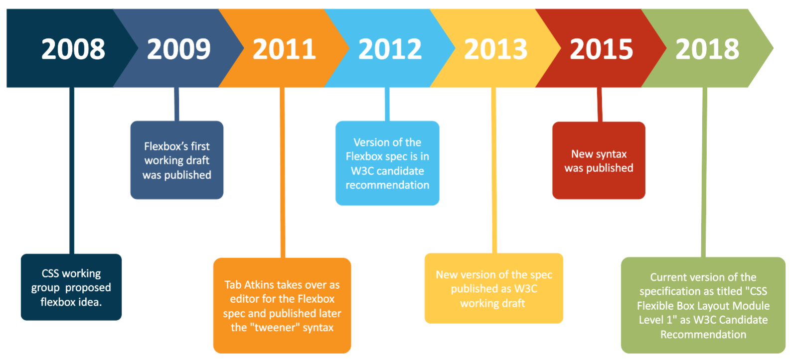
The CSS working group published the Flexbox’s first Working Draft (W3C WD) on July 23rd 2009 on the W3C website. Some of the first browsers that implemented it were Firefox and WebKit based browsers, and there were different results and some inconsistencies. In 2011, the Flexbox specification has changed. Especially, Tab Atkins took a new editor over and published later the "tweener" unofficial syntax which were supported in Chrome, Opera and Internet Explorer 10.
Between the year 2012 and 2013, changes made again to the syntax and the specification updated status from being a W3C Candidate Recommendation (W3C CR) to a W3C WD. In 2015, a new syntax was published and the efficiency of Flexbox algorithme was increased. The current version of the specification as of October 2020 is dated 19th November 2018 and titled CSS Flexible Box Layout Module Level 1 and it is a W3C CR, which means it still subject to change and other specifications may supersede it.
Flexbox model Terminology
To make things easy for you before diving into practice, this section defines a set of flex flow–relative terms mapped to physical directions, axes, and sizes.

- Flex container is the box within direct children are flex items representing its in-flow contents.
- Main axis : It can be whether a row or a column along which flex items are laid out.
- Cross axis : The axis perpendicular to the main axis.
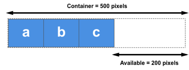
In the figure above, you can notice that the main axis is a row, thus the cross axis is a column.
- Main start and main end: flex items are placed within their container from the main start side toward the main end side.
- Cross start and cross end: flex items can be laid out on multiple (horizontal/vertical) lines from the cross start line toward the cross end line.
The same, you can notice that the main start is the left side, and the main end is the right side. Whereas the cross start is the top line, and the cross end is the last bottom line.
- Main size: the width/height of the flex container in the main axis.
- Cross size: the size of the flex container in the cross axis.
Again in our example, the main size of the flex container is its calculated width, while its cross size is its calculated height.
Now as you've seen the primary concepts, if you feel ready, let’s begin to find out what CSS properties are used in Flexbox module and their roles. Below, we'll use CodePen examples where you can also find comments to understand each of these properties a bit more.
Flexbox CSS properties
Unlike many other properties, in Flexbox, some CSS properties are used only on the flex container, and others only on the flex items.
Flex container CSS properties
- Create a flex container
You can use two options of the display property to create a flex container, display:flex as block-level or display:inline-flex as inline-level.
- Define the Flexbox axises
As you learned above, the cross axis is implicitly determined form the main axis. So you only have to define the main axis using the flex-direction property.
- Lay out flex items within their container
Contrary to other CSS modules, Flexbox offers various methods to arrange flex items with the two following simple properties that I often use to lay out web app components.
justify-contentallows you to align flex items along the main axis.
align-itemsallows you to align flex items along the cross axis.
- Lay out flex items on multiple lines
You may be wondering how Flexbox can lay out more flex items if they exceed the main size of their container. Don’t worry, Flexbox comes with the flex-wrap property that controls whether the container is a “single-line” or “multi-line”, and the cross axis direction that the new lines, called “flex-lines”, are stacked in.
Note : every line in multi-line flex container behaves as a single-line flex container independtly from others.
- Packing flex-lines along the cross axis.
As Flexbox is a single dimension based model, the way you align flex items within their single-line container in the main axis is also possible for flex lines of multi-line flex container when there is extra space in the cross axis. To be able do that, Flexbox introduced the align-content property that works simply as justify-content.
Note : the
align-contentproperty has no effect on how flex items are laid out along a flex-line.
Flex item CSS properties
- The flexibility factors
Before you go through this part and simply understand what comes later, let’s first clear for you an important thing which is the idea behind the flexibility aspect. Flex container makes its children flexible in their sizes (width/height) to explore the available space in the main axis. It distributes free space to its items to fill its main size, or shrink them to prevent overflow.
Thus, there are two types of free space.
So that you can control this free space, Flexbox defines the three following properties: flex-basis, flex-grow and flex-shrink.
- The
flex-basisproperty
It’s the initial size of a flex item before any growing or shrinking. It accepts the same values as the width and height properties, plus content. So the most used values are as follows :
flex-basis: content : the item’s content size.
flex-basis: 200px : a specified size.
flex-basis: auto : the main size property (width/height according to the main axis) of the flex-item, if its value is itself “auto”, then the used value for flex-basis is “content”. For instance, if width:40px then flex-basis:40px.
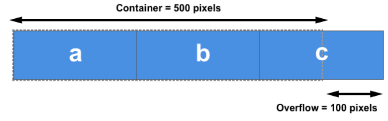
Note: Free space is the difference between the container's main size and the sum of the flex-basis of all flex items on the line. That's called the initial free space
- The
flex-growproperty
The float factor which determines how much a flex item will grow, starting from the flex-basis value, relative to the rest of the items in the container when positive free space is distributed. By default, it is set to zero.
The calculus of the growing size is (A / B) * C = ([flex-grow value] / [sum of flex-grow of all flex items on the line]) * [free space size]
Note : If the sum [B] is less than one, the free space becomes the product of this sum and the initial free space (C = B * C). Hence, each flex item gets exactly what it requests, thus A * C. See more details
- The
flex-shrinkproperty
The float factor which determines how much a flex item will shrink, starting from the flex-basis value, relative to the rest of flex items inside the flex container when negative free space is distributed. When omitted, it is set to one.
The shrinking size is calculated the same way as the growing size except another relative factor is used in the ratio (A / B) instead of the flex-shrink value, called the scaled flex shrink factor which is the product of flex-shrink and flex-basis values.
Note : When the sum of all flex items' flex-shrink on a line is less than one, the free space, as for
flex-grow, is also the product of this sum and the initial free space. See more details
- Override the cross-axis alignment
As the align-items property sets the default alignment for all flex items, Flexbox offers the align-self property that allows this default alignment to be overridden for individual flex items.
- Reorder the flex items
In flexbox, you can also change the order of flex items by just giving an integer value to the Flexbox property order property for a flex item. By default, the items have order: 0.
Flexbox algorithm treats these flex items in ordinal groups. The items which belong to the same one are displayed in the same order they have in the source document.
Conclusion
In the light of the above, Flexbox is a great technological advancement on the web. It's a modern layout model that allows elements to be aligned and to distribute space between them, which makes it a great tool for flexible and responsive design systems.
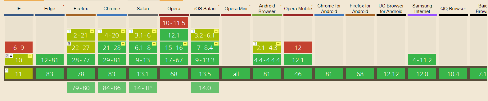
Flexbox has been around since 2009, and it’s beginning to be widely supported by all modern browsers. If you look at Flexbox on Can I Use? you’ll see that it has great support across the board.
Personally, I use Flexbox for the following main things : scaling, distributing the positif free space, horizontally and vertically aligning, and reordering flex items within their flex container.
If you want some practice with Flexbox, check out the Flexbox Playground to learn the basics of using Flexbox.